In an era dominated by digital communication, emails remain a stalwart medium for conveying messages, promotions, and information to a wide audience. To ensure your emails effectively reach and resonate with your recipients, employing responsive design is paramount. This blog post delves into the world of responsive email design, exploring its significance, benefits, and best practices. From “how” to get started to the nitty-gritty “what” of creating responsive emails, we’ve got you covered.
What is Responsive Email Design?
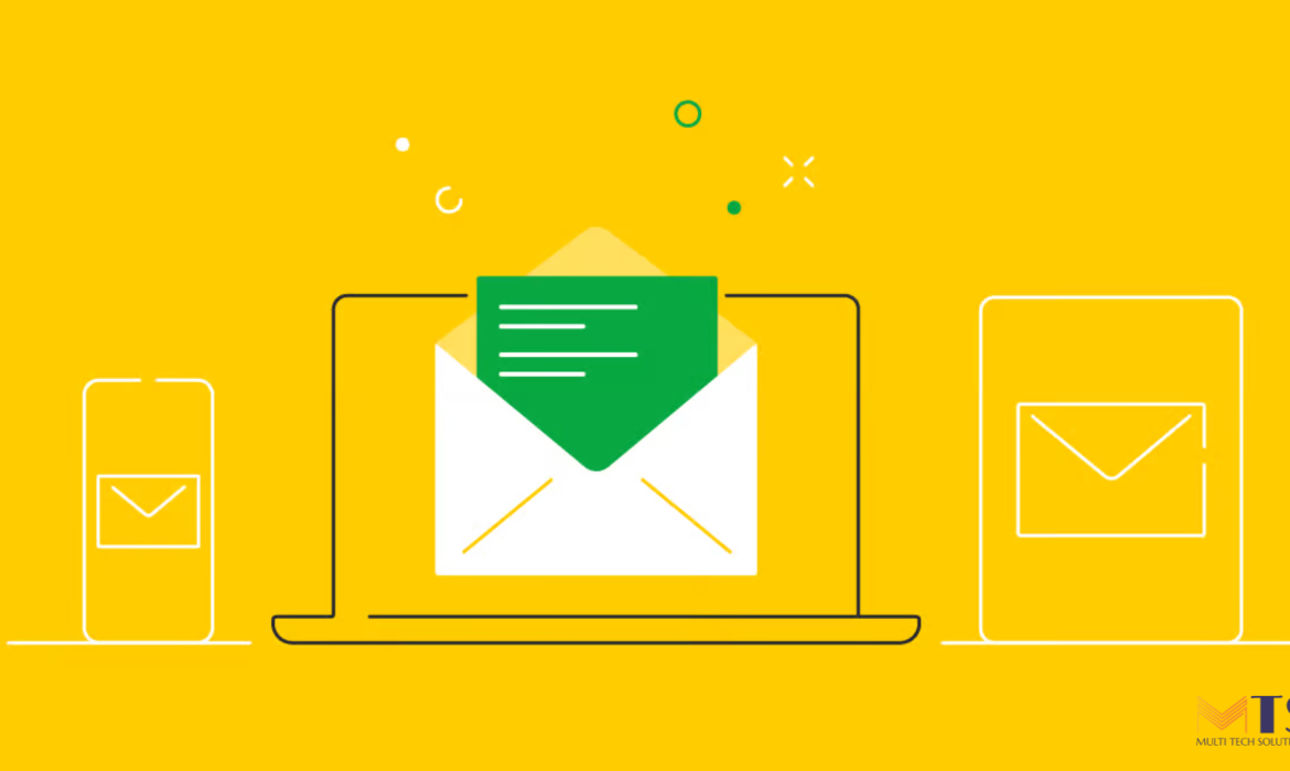
Responsive email design is an approach that ensures your emails render optimally across various devices and screen sizes. It involves crafting emails that automatically adapt their layout, images, and fonts to provide recipients with an ideal viewing experience, whether they’re checking their inbox on a desktop, tablet, or smartphone.
Why Does Responsive Email Design Matter?
As the use of mobile devices for email consumption continues to rise, failing to embrace responsive email design can lead to missed opportunities and frustrated recipients. Here’s why it matters:
– Enhanced User Experience: Responsive emails guarantee that your content is easily readable and navigable, irrespective of the device used.
– Increased Engagement: Emails that look great and function well on any screen are more likely to capture readers’ attention, leading to higher open rates and click-through rates.
– Brand Consistency: Consistently designed emails across devices reinforce your brand’s identity and professionalism.
Benefits of Responsive Email Design
Embracing responsive design for your email campaigns offers a range of benefits that directly contribute to your communication’s effectiveness:
– Wider Reach: Your emails will reach a larger audience as they adapt to various devices, catering to users’ preferences.
– Improved Engagement: A seamless viewing experience translates to higher engagement rates, as recipients can easily interact with your content.
– Higher Conversion Rates: Engaged recipients are more likely to follow through with desired actions, such as clicking links or making purchases.
– Data-Driven Insights: Responsive design enables you to gather accurate data on user behavior across devices, aiding in refining future campaigns.
How to Achieve Effective Responsive Email Design
Creating responsive emails requires careful consideration of design and coding elements. Follow these best practices to ensure your emails shine across devices:
1. Simplify Content: Start with a clear and concise message. Minimalistic content is easier to adapt to different screen sizes.
2. Mobile-First Approach: Design with mobile devices in mind first, then expand for larger screens.
3. Fluid Grids: Use fluid grids that adjust proportionally to the screen width, maintaining a balanced layout.
4. Readable Fonts: Opt for legible fonts and font sizes that remain clear on both small and large screens.
5. Optimize Images: Compress images for faster loading times, and use responsive image techniques to ensure they adjust appropriately.
6. Call-to-Action Placement: Position important buttons or links within the thumb-friendly “tap zone” for easy interaction.
7. Media Queries: Implement media queries in your HTML and CSS to apply different styles based on screen size.
8. Testing is Key: Thoroughly test your email on various devices and email clients to ensure consistent rendering.
Tools for Crafting Responsive Emails
Several tools can streamline your responsive email design process:
– Email Editors: Platforms like Mailchimp, Constant Contact, and HubSpot offer intuitive drag-and-drop editors with responsive design features.
– Litmus: A testing and analytics platform that helps you preview and optimize emails across different clients and devices.
– Responsive Email Frameworks: Frameworks like Foundation for Emails and MJML provide responsive templates and coding structures.
Optimizing Media in Responsive Emails
Media elements, like images and videos, play a crucial role in email engagement. Here’s how to ensure they shine responsively:
– Image Optimization: Resize and compress images to reduce load times without compromising quality.
– Alt Text: Provide descriptive alternative text for images, ensuring recipients understand the content even if images don’t load.
– Video Considerations: Use GIFs or consider embedding videos via platforms like YouTube to ensure compatibility across devices.
Strategies for Testing Responsive Emails
Before hitting “send,” ensure your emails perform impeccably across devices:
– Real-Device Testing: Test your emails on actual devices, covering various operating systems and email clients.
– Use Testing Tools: Tools like Litmus and Email on Acid simulate email rendering across different clients and devices.
Seamless Experience Across Devices
In today’s fast-paced digital landscape, responsive email design is more than just a good practice—it’s a necessity. By adhering to these best practices, you’ll unlock the power of effective communication across a diverse range of devices, connecting with your audience wherever they are.
In closing, responsive email design holds the key to reaching your audience effectively, enhancing engagement, and boosting conversions. Embrace this essential approach to ensure your email campaigns not only convey your message but also resonate with recipients, fostering stronger connections and driving impactful outcomes.